
Ecommerce Web Development: Why Product Pages Should Match the Product
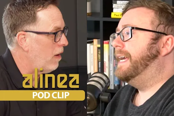
Watch the Pod Clip
A lot of ecommerce sites grow into a problem they do not notice right away. The catalog gets bigger, more categories get added, and the website keeps using the same product page structure for everything. At first that feels efficient. One template is easier to manage. The site looks consistent. The team can move faster. Over time, that convenience starts working against the customer because the page stops reflecting what people actually need in order to buy.
That is where ecommerce web development starts creating real value.
For us, web development is useful when it improves the buying experience in a way the customer can feel. On a larger site, that usually means thinking beyond whether the page “works” and asking whether the page helps the buyer make a decision. Baymard’s 2026 benchmark found that up to 62% of ecommerce sites have mediocre or worse product page UX, and it found that users often abandoned otherwise suitable products because of solvable product-page issues. Baymard’s 2025 product-list benchmark also found that 58% of desktop sites and 78% of mobile sites perform poorly to moderately on product-list UX, which matters because large catalogs force customers to move through lists before they ever reach a product page.
Why generic product pages become a problem
The transcript gets to something most brands eventually run into. When a store has thousands of SKUs, a generic product template starts flattening the differences between categories that buyers actually treat very differently.
Someone shopping for apparel tends to care about things like fit, sizing, fabric, and how the item looks from multiple angles. Someone shopping for detergent or a simple cleaning product usually cares much more about quantity, ingredients, use case, price, delivery, and whether the product solves the problem they came to solve. Those are different buying decisions, even if both pages technically live inside the same store.
When the product page ignores that difference, the website makes the customer work harder than it should.
That is why we do not think product-page strategy should begin with visual sameness. It should begin with buyer intent. What does this kind of customer need to feel informed enough to move forward? Which details reduce friction here? Which assets actually add value on this category of product, and which ones are decoration that makes the page heavier without helping the decision?
That is web development as a business lever, not web development as surface polish.
What good ecommerce web development is really doing
A lot of people hear “web development” and think about code, design, or site speed in isolation. Those things matter, but the real value is broader than that. Good ecommerce web development gives the business a site structure that supports the way people actually shop.
On a practical level, that often means building product-page systems that can flex by collection, category, or product type instead of treating everything as interchangeable. In Shopify or WooCommerce, that may mean applying different templates or template logic by collection. On a custom build, it may mean creating modular sections that show up only where they help the customer. The goal stays the same either way: the right information, on the right page, for the right product.
Google’s current ecommerce documentation supports that same way of thinking from a search perspective. Google says product structured data can help product pages appear more richly in Search with details like price, availability, ratings, shipping, and return-policy information, and it specifically supports product variant structured data so Google can better understand variations of the same parent product. Google also recommends breadcrumbs and other ecommerce-relevant structured data to help it understand site hierarchy and page context more accurately.
That matters because web development should help both the customer and the search engine understand what makes the page useful.
Why more product templates can improve conversion
The transcript makes a strong point here. More product templates can increase conversion when they are tied to how people shop different categories.
That does not mean every SKU needs its own custom page. That would create a maintenance problem on most sites. It means different types of products often deserve different ways of presenting information.
A category where visuals drive the sale may benefit from richer imagery, comparison details, swatches, and more immersive media. A category where function matters more than aesthetics may need clear specs, simpler hierarchy, trust cues, shipping information, and direct use-case language higher on the page. Some products benefit from 3D models or interactive media. Others do not. The point is to give the user something they genuinely care about instead of forcing the same presentation on products with completely different buying logic.
Baymard’s research helps explain why this matters. Its product-page benchmark describes the product page as the centerpiece of users’ purchasing decisions and notes that most users pass through product pages before deciding whether to buy. Baymard also found that a buildup of medium-level UX issues on product pages often pushes users to leave, which is exactly why category-fit presentation matters more than teams sometimes realize.
What this looks like in practice
We would usually approach this by starting with product behavior, not page design.
We would ask:
What does someone care about most in this category?
What objections come up before purchase?
What details actually move the decision forward?
Which pieces of content help, and which ones only make the page longer or heavier?
That process often leads to a more useful page strategy.
Apparel pages may need stronger size logic, fit guidance, variant handling, and visual depth. Higher-consideration products may need comparison tools, richer education, or clearer trust elements. Simpler consumables may need cleaner hierarchy, prominent pricing, shipping clarity, and less visual clutter. The web development work matters because it gives the site enough flexibility to support those differences without turning the catalog into a maintenance mess.
This is one reason Baymard emphasizes that product-list UX and filtering UX are tightly connected to how easily users find suitable products in the first place. If the path into the product page is already difficult and the product page itself adds more friction, the site starts compounding its own problems.
Why this creates value for clients
From a client perspective, this is where web development stops being abstract.
A better product-page system helps customers find what matters faster. It reduces the amount of unnecessary content on pages where it does not help. It makes important content easier to surface on categories where it does help. It can improve conversion, make merchandising decisions easier, and give the marketing team a stronger destination for paid traffic.
It also creates a more scalable site. Once the page logic is built properly, the business can add products, launch collections, and refine categories without rebuilding the whole experience every time. That matters on growing catalogs because the cost of using the wrong structure compounds just as quickly as the value of using the right one.
This is also the kind of work that fits how we talk about growth on our Why Alinea page. We are not trying to create louder websites. We are trying to create systems with more clarity, more alignment, and more useful structure. Our site explains that we moved from execution-only work toward building systems that support predictable revenue and long-term growth, and this is a clear example of what that looks like in practice.
Why large sites feel this problem first
Smaller stores can sometimes get away with a generic page longer because the catalog is narrow and the buying behavior is more uniform. Larger sites feel the pain faster because the gap between categories becomes harder to ignore.
A store with thousands of SKUs is serving multiple product types, multiple buying mindsets, and often multiple levels of consideration. Once that happens, one-size-fits-all presentation starts creating subtle friction all over the site. The business may still generate revenue, but it is doing it with avoidable drag built into the experience.
That is part of what makes web development valuable to clients. It removes unnecessary drag from a site that may already be producing results, which gives the business a cleaner foundation to build on. Our homepage frames our work around predictable sales growth and helping stuck online businesses scale more clearly, and this kind of structural improvement fits that promise well.
What to do next
If your catalog keeps growing and your product pages still all look the same, we would treat that as worth reviewing. The question is not whether the page is technically live. The question is whether the page reflects how people buy that kind of product.
That is where the value is.
Start by looking at categories instead of individual SKUs. Identify which product types have different buying behavior, different objections, or different information needs. Then build the page logic around those differences. Once the site is helping users make decisions more clearly, everything else tends to work better too, from paid traffic to merchandising to organic search.
If you want to see how we think about building growth with more structure and less guesswork, our case study shows how clarity changes the trajectory of a business. If you want help figuring out whether your site structure is helping or quietly slowing people down, book a call with our team. Our book-a-call page frames that conversation around strategic help for online businesses that want a clearer path to growth.
